Case Study
Overview of Client Needs
We worked with Daphne with RealtySouth; the client, a REALTOR®️ , wanted to refresh their visual identity to appeal to home buyers. She wanted a modern, clean look to reflect her commitment to Real Estate. To achieve this, I thoroughly analyzed her brand identity and developed a clean look with clarity and simplicity.
Target audience
Daphne, the client’s target audience was primarily comprised of home buyers and sellers in the local area looking for a reliable and trustworthy real estate agent. The demographic was mainly middle-aged and consisted of both families and individuals. Our graphics were designed to resonate with this demographic by featuring clear and concise messaging, utilizing high-quality images of properties, as well as highlighting the unique value of the real estate agent.
Design Process
I began by analyzing the needs of Daphne Curtis’s target audience and identifying areas where their existing marketing materials fell short. I then collaborated with the client to determine the visual style and tone she wanted to convey. Using photoshop and the images provided by the client, I created several mockups, which we refined through a series of iterations, incorporating feedback from the client to ensure alignment with their vision and goals.
Graphics
To achieve the client’s goals, I created a range of graphics that included high-quality images of properties. I also designed several branded graphics for social media platforms like Facebook and Instagram, which helped to increase engagement with potential clients. All of my graphics for the client Daphne were carefully crafted to align with the brand identity of Daphne Curtis and to convey a sense of professionalism and trustworthiness.
Conclusion:
The graphics I created for Daphne Curtis with RealtySouth significantly increased engagement and leads from their target audience. Through our collaboration, we identified critical areas where design improvements were needed and delivered a solution aligned with the client’s brand identity and messaging. In the future, I recommend that Daphne with RealtySouth use visually appealing and informative graphics in their marketing efforts to stand out.
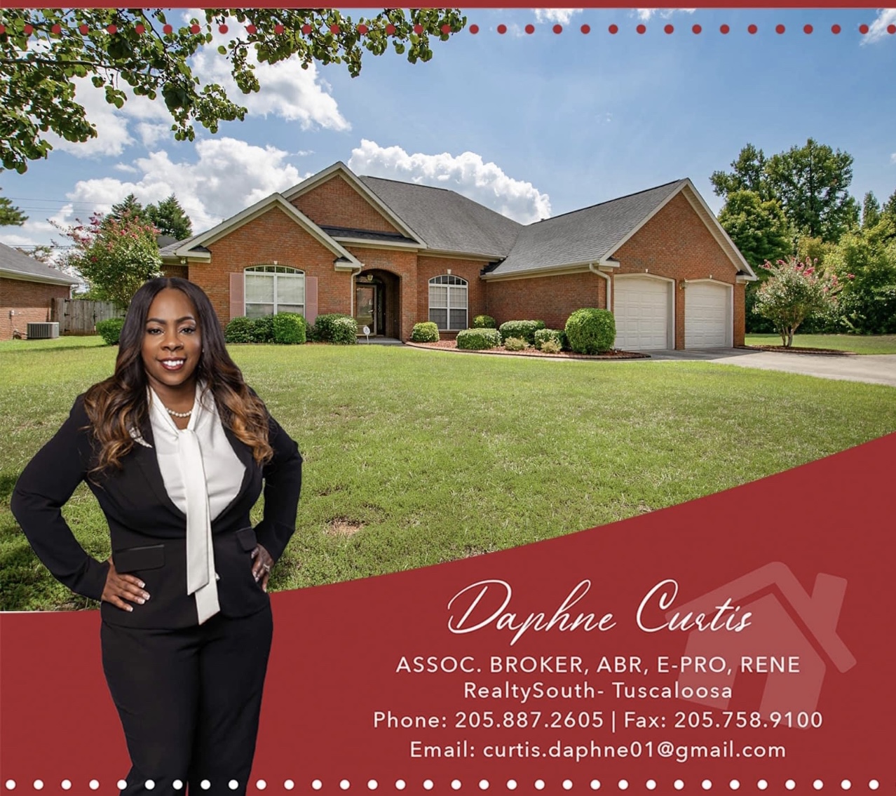
Design #1 Old Concept
The graphic is not visually appealing and lacks attention-grabbing elements. Using multiple fonts clashes and creates visual competition, making the design confusing. Additionally, random dots at the top of the graphic do not fit the overall design. Furthermore, the image of the yard is more prominent than the home for sale, which de-emphasizes the advertised property. As a result, the intended message of the design is unclear, and it may not be effective in attracting potential buyers.
Design #1 New Concept
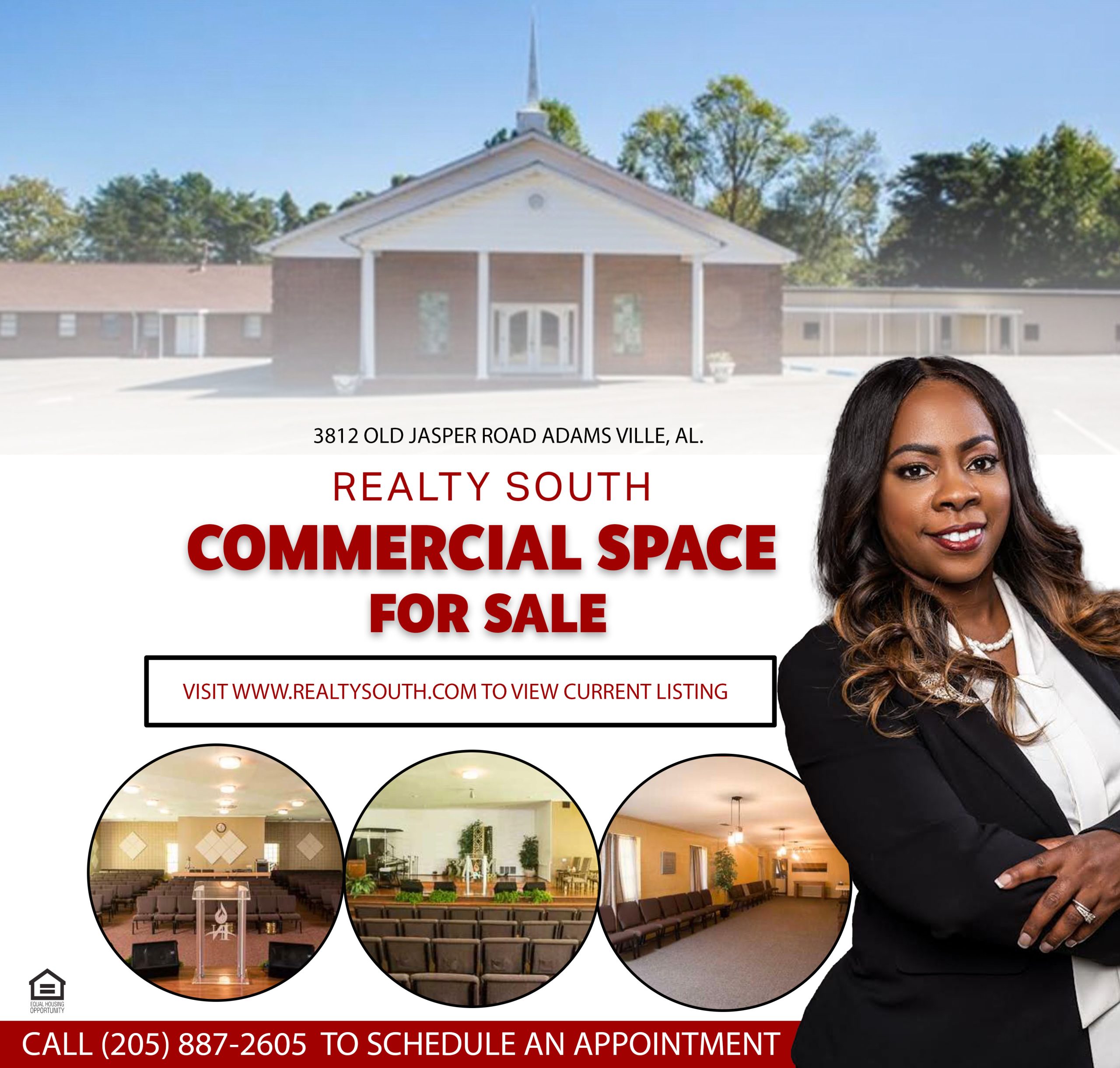
This straightforward design conveys the client’s message that she has commercial property for sale. It is easy to read and understand, with a clear glimpse of the property’s interior through the three listed images. The design includes prominently displayed contact information, including a readable contact number and website address, for more details. Overall, the plan adequately represents the client’s commercial property, providing potential buyers with the necessary information to take further action.
Design #2 Old Concept
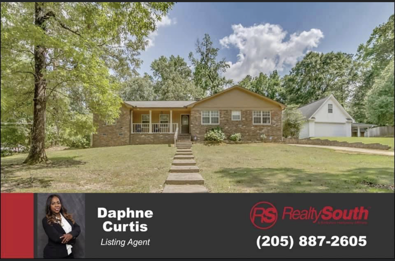
The graphic does not provide a close-up view of the home, and the client’s image, Daphne, is barely visible. Furthermore, it does not feature any images of the home’s interior, which could have enticed potential buyers to want to see more. As a result, the design may be less effective in attracting prospective buyers and showcasing the property’s features.
Design #2 New Concept
This graphic provides an up-close view of the home and features a clear and prominent image of the client, Daphne. Multiple images of the home’s interior showcase its key features and entice potential buyers to want to learn more. As a result, the design effectively showcases the property and may be more successful in attracting prospective buyers.

Design #3 Old concept
The layout of this design needs to be corrected and easier to follow. The client name has been duplicated on the graphic, causing confusion and taking up unnecessary space. In addition, the fonts and backgrounds of the graphic clash with the subject matter, making it unclear and distracting. As a result, the overall effectiveness of the design is diminished.

Design #3 New concept
The current graphic design fulfills the client’s requirements and has been laid out according to their preferences. It is designed for easy readability, ensuring potential clients looking for a real estate agent can quickly gather essential information such as the number of homes she has sold, awards received, and the real estate agent’s ranking in the area.

